

The Ugliest Baseball Cards of All-Time?
Or just dirt and airbrush on the rearview mirror?

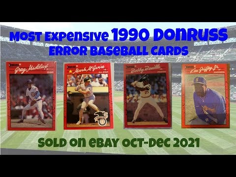
This week on YouTube, we took a look at some of the most expensive 1990 Donruss error cards running around out there in the wild:
Aside from the oxymoron of “expensive 1990 Donruss,” this exercise reminded me of how ugly these cards are — or at least how most folks think they’re pretty ugly.
I agree they’re jolting, but I always appreciated how well the bloody borders matched with my Cincinnati Reds.
But you know which cards really ARE ugly?
These ones right here…
1991 Fleer

Like most new issues of the day, I first laid eyes on these babies in the pages of Sports Collectors Digest. By 1991, the magazine had moved up their technology to the point that they could render such early looks at upcoming card sets in full color (albeit on the standard pulp paper stock).
I’ve never wished for a black-and-white-only rendering so fervently in my life.
I once heard tell of a man who loved these yellow-bordered demons — let that be a lesson to you to always be on your guard. You never know what sort of rowdy character you’re dealing with in this life.
1990 Topps TV Chuck Cottier

Chuck Cottier is not an ugly man.
The 1990 Topps TV set is sort of an ugly issue, but not that bad by the standards of the day, and not compared to — say — 1991 Fleer.
But our man Chuck appeared to be none too happy about his lot in cardboard life on this one, and the resulting expression is the ugly sort that your average toddler might unleash when he’s way past his naptime.
1981 Donruss John Ellis

I’m picking on this card as a sort of exemplar for 1981 Donruss as a whole.
It was a dark, crowded, thin-stocked, error-filled, crap mess of a first effort by Donruss … but I still love it.
Even if John Ellis does look like some bummed kid who just got his lunch stolen and forgot to study for the math test that’s coming up in 15 minutes.
1974 Topps Team Checklists

These are sort of neat in concept, and I appreciate them now, sitting here as an old dude who doesn’t have to dread pulling one from a pack.
Looks like something I might have designed.
But they really are pretty rough from an aesthetic standpoint — all the red, green, and yellow, with a bunch of scribbles.
Yeah, yeah, they’re facsimile autographs, but I still go back to that “pulling one from a pack” concept — must have been a big disappointment for kids, even though these were billed as “bonus” cards.
1974 Topps Traded Ron Santo

Hideous airbrush job.
Ron Santo with the wrong team.
Ron Santo swallowed up by massive, gaudy design elements.
This card has a lot going for it when it comes to being ugly. So much, in fact, it almost makes Santo’s base card from the same year look like a work of art:

So what cards do you find especially ugly?
I’d love to hear your picks, and I’m fully dosed with Dramamine, ready for the hideousness you might unleash.
Until next time, here’s hoping the ugliness of the baseball lockout is soon behind us because, I don’t know about you, but I’m about ready to start hearing about pitchers and catchers.
Thanks for reading,
Adam
P.S. — If you haven’t already, now would be a swell time to subscribe to our YouTube channel. :)