
Baseball Cards that Grew on Me
Baseball Cards that Grew on Me
Do they have an ointment for that?

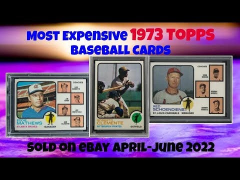
One of our videos this week took a look at which 1973 Topps baseball cards are making the most noise on the market these days:
That exercise reminded me that the ‘73s are NOT my favorite set of all time … but that I like them a whole lot better than I used to.
Why?
Well, let me tell you, along with diving into a few other sets that have grown on me (better get that looked at).
1973 Topps

I’ve always found the 1973 Topps set to be sort of depressing, probably because that’s how the early 70s feel to me in general. The grainy, blurry photos and school-cafeteria-generic card design only add to the malaise.
But, just a few years ago, I realized the little silhouetted figurines on card fronts actually correspond to the pictured player’s position, and that started to change my perception a bit.
Little details can make a big difference, after all.
And 1973 Topps does feature some pretty nifty action shots, blurry or not. Those vertical back, while an oddball, are also pretty easy to read and add some variety to an era where such was in short supply.
This thing just may have some legs, after all.
1976 Topps

Same sort of deal with 1976 Topps, where the little baseball men on the front of each card correspond pretty well to the big baseball men on the front of each card.
Never liked the two-bar design as a kid, and the photos felt dark and dreary.
But now, after perusing thousands and thousands and gobs and gazillions of baseball cards over the years, in real life and online, I can appreciate the ‘76s more.
The little baseball men, the colorful design, the baseball-y backs, the fun subsets, and some of the best real action shots of the decade — this thing is pretty solid, after all.
1990 Topps

The first black-and-white shots of these cards in Sports Collectors Digest, along with a textual description of the colorful borders had me excited — Topps was bringing back their 1975 Topps design!
That one had been my favorite set all through my early collecting years, so I was stoked.
Then, well, 1990 Topps didn’t look anything like 1975 Topps. Bummer.
A few years ago, though, someone mentioned online that Topps’ goal with the 1990 design was to make each card look like a comic book panel, complete with the dotted color fades that let you know you’re reading pulp.
It was a lightbulb moment for me, one that elevated 1990 Topps from what-the-heck to a misunderstood genius.
Photos aren’t bad, either.
1991 Score

This was the heart of the Junk Wax Era, and we all pretty much knew it, too.
Every set was everywhere, and there were millions of different offerings.
To make matters worse, there were millions of different cards in the 1991 Score set, too. And Score was, by and large, soulless.
But I just so happened to come into possession of a 1991 Score factory set a few years ago — think I traded some belly-button lint for it or something.
And let me tell you — this thing is fun!
Huge, with about 900 cards, 1991 Score featured different colored borders depending on card number.
All sorts of different subsets, from cartoon-head All-Stars to laser-show Master Blasters to black-and-white and shirtless(!) Dream Teamers.
This is one of those behemoths you can comb through a hundreds of times and notice something different each time.
Definitely worth the price of admission.
—
How about you? What sets did you not care too much for right off the bat, but have grown on you over time?
I’d love to hear your picks (and any antidotes you’ve discovered, should I get similarly bitten).
Until next time, watch out for those hidden gems lurking in the dark corners of your collection. They tend to lurch out at you when you least expect it.
Thanks for reading.
—Adam