


5 Baseball Cards that Demand to Be Loved
Or at least whisper softly in your ear, and cast their spell

Luke Easter was born 109 years ago today, and any mention of his name is a good excuse to dig into a special “pile” of cards.
To wit, below are five baseball cards that may not be anything special on the surface — no super-rare rookies, no razzle-dazzle, not all Hall of Famers — but that I find irresistible all the same.
See if you agree.
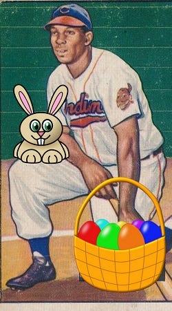
1951 Bowman Larry Doby (#151)

I first laid eyes on this Doby card in some hobby magazine or newspaper during the 1980s and fell in love with it right away. I’m not sure which periodical made the introductions, though there’s a better than even chance it was Sport Collectors Digest, which likely means our first encounter was in black-and-white.
Didn’t matter whit.
The billowing flannels, the perfect cropping, the balanced stance, the electricity of a filled-to-the-brim classic ballpark all conspired to make me want to be there, in that moment, witnessing that history.
Or at least holding that card.
Later on, when I learned of Doby’s historical significance and on-field greatness, I only loved the card more.
1951 Bowman Luke Easter (#258)

Maybe it was my early love for the Doby card that made it easy for me to love this Easter card, too, whenever it was I first “found” it.
The two men were Indians teammates, after all, and both were wearing those classic uniforms. Easter flashes the old-school Tribe logo on his sleeve, to boot. Add in the odd sort of background that only early Bowman cards could seem to muster (Willie Mays in front of a tarp in front of a shed, for example) for a little mystique, and you have another card that can’t be ignored.
Plus, this is a fun card at, you know, Easter time.
1957 Topps Jim Gilliam (#115)

If you’re keeping score, this is the second week in a row that Gilliam has made an appearance in these “pages.” Last week he was Junior, though; here, he’s “Jim.”
The short story here is that I was lucky enough to latch onto a beat-up copy of this card as part of a batch of beat-up old cards that I bought at a flea market, antique shop, auction, or garage sale — I forget which — in the 1980s.
It became one of my favorite all-time cards right away, and it still is. The colors are perfect, the saturation and tones are nostalgic and emotional somehow, and the blurry stadium background promises a baseball Valhalla that will always be just beyond our mortal reach.
The longer story is one I had to write, well, longer — right here.
All in all, this is a card I’d put up against the best of all-time, Dodgers Blues and all.
1978 Topps Doug Ault (#267)

Doug Ault was a minor bright spot for a predictably bad 1977 Blue Jays team, who lost 107 games in their inaugural season as an expansion team.
That summer, Ault hit .245 with 11 home runs and 64 RBI as a rookie, though he had played nine games for the Texas Rangers in 1976. That performance with Toronto was enough to earn him a slot on Topps’ All-Star Rookie roster and this nifty 1978 card that he shared with Yankees great Thurman Munson.
This is a great, candid baseball shot that’s pretty easy to come by with smartphone cameras and drones and the like, but that you didn’t see much of in the 1970s. Here we have two men going about their jobs — jobs that just about every little boy dreams about clocking in for someday — and we get to see what it’s like to be a major leaguer between pitches.
Check the bat.
Check the mask. Check the glove. Check the dirt.
The grass and the on-deck circle are keeping watch in the background.
1982 Donruss Carl Yastrzemski (#74)

So, I picked this card as the best of 1982 over on the blog a while back. It was part of a fun exercise and series of articles, but making those types of picks is a personal thing and, for me at least, depends on which way the wind is blowing.
I probably would not pick this card as the best of 1982 every day, but I still would on some other. Still, I do love this card because it’s so unusual to see a player like Yaz attempting a drag bunt when he usually shows up in a posed batting shot or a full-on action shot.
And the Red Sox uniform is an unusual model, too — yes, I know it was probably an old photo when Donruss issued it, but still…
This one hits me on a visceral level and reminds me every time I see it that 1982 Donruss is not all frog spit and pond scum.
—
So, do you like any of these cards, too?
And which cards do you love even though there’s really no objective reason for them to pull at your heartstrings — or eye strings — the way they do?
I’d love to hear your thoughts and picks!
Thanks for reading.
—Adam
Doesn't it seem weird that Topps would use a brown font color for the Blue Jays? It's like the Red Sox in yellow, but that's a thing too, I guess?
Love it when you go pre-1985 (no matter how far back) as a fairly serious collector (50,000 cards dating from 1888 until today with a heavy emphasis on 1910-1978). Thanks to many trades with a middle-school History teacher in the late '70's, I came into a wealth of 1950-52 Bowmans. Still have most of them. No doubt you've featured the '51 Bowman Paul Richards (sorry if I missed it) - how can you not love creative license on a trading card? Up there in weirdness is the '76 Topps Kurt Bevaqua bubble gum champ card. The '51 Bowman Sibi Sisti is also great - for name recognition alone, but also for the wistful look of an era that many fans, like me, wish they could've witnessed first hand. Thank you for the classic takes.